I've been experimenting with the sparrows whom frequent the bird feeder on my apartment balcony. They've become so accustomed to being fed that on most morning I find them waiting patiently waiting for me to fill it. As a result they are becoming quite tame and tolerate my close proximity because they know it means a free meal.
I've been experimenting a tad - by removing the feeder and putting in its place different (and I'm sure to them) odd shaped containers holding their bird seed, just to see how they will react and also hoping for different and unique photo opportunities.
In this example I replaced their feeder with a wine goblet hoping to catch a photo of a bird inside it, but have yet to do so. Instead they stand just outside it - pecking at the seed through the glass, sometimes furiously. To them it must seem like some kind of alien force-field - tempting them with food so close yet unreachable.
In this shot the lighting was just about perfect as this female came up and lifting one leg tried to peck through the glass. Looking at it all I can think it's too bad sparrows don't wear top hats and sing "Putting on the Ritz."
Sunday, November 29, 2009
Sparrow under glass
Posted by Steve Douglass at 5:01 PM 0 comments
Monday, November 16, 2009
Mountain biking is fun ...


Taken during then Palo Duro Panhandle Marathon.
(C) Steve Douglass
SEE MORE AND BUY YOUR PHOTO HERE.
Posted by Steve Douglass at 6:33 AM 0 comments
Tuesday, November 10, 2009
How do they know?


In the fall and winter I put out a bird feeder. It's on my back patio and about ten feet from where I sit at my computer, working on web sites, writing, etc. My camera sits on my desk, always ready and that's how I've been able to get such great shots of the sparrows and finches.
I hope it happens tomorrow so I can get a better shot - one that is focus and lit better.
This shot gives you a better idea of what Salvador sees.

Posted by Steve Douglass at 3:15 PM 0 comments
Monday, November 9, 2009
Tuesday, November 3, 2009
Monday, October 26, 2009
Pain On The Plains
Just a few shots from the "Pain On The Plains" mountain bike race in Palo Duro Canyon on Sunday. ALl the photos will be published for purchase on wrongwayphoto.com soon.
Click to enlarge.

(C) Steve Douglass


Posted by Steve Douglass at 12:54 PM 1 comments
Labels: Pain On The Plains
Friday, October 16, 2009
Sunday, October 4, 2009
Little does it know ...
Little does it know, resting in my grandson's dirty palm, that the being who holds it could easily end its life.
It's so small - so vulnerable - and blissfully unaware. My grandson found it as it jumped out from under a small pumpkin he had found in a farmer's patch near Etter, Texas.
"Can I keep it?" Gavin asked his grandfather.
Looking at the little toad I couldn't help but be reminded of the many times when I had seen my grandson throw a fit when he was denied something.
I knew the toad's fate was dependent on my reply.
I bent down and put my hand on his shoulder, making sure to look him in the eye, with my eyes filled sincerely with concern for both little ones.
"Would you like a giant to keep you?" I replied.
"A giant?" he asked confused.
"To the toad - you must look like a giant monster!" I said. "You could easily squish him and he knows that."
"He does?" Gavin replied suddenly realizing he must seem very big indeed to the little creature in his hand - something my little grandson had never experienced.
Gavin isn't very tall. Everyone in his class is taller - even his sister is taller - and that's something that bothers him.
"It's up to you. You could keep him in a jar -away from his toad family and friends and he would never be happy - and then one day he would die and you'd be sad ...
... or you could let him go now and both of you go on with your day - both happy."
"You got to catch a cool little toad - and he saw a giant and lived to tell about it! You'll be famous among the toads as the giant who was nice!"
That's a much better story," Gavin said.
He bent down, parted some reeds and let the little toad hop out of his hand.
-Steve Douglass 
Posted by Steve Douglass at 11:31 AM 1 comments
Sunday, September 27, 2009
Monday, September 14, 2009
Variations on a theme.
CLICK TO VIEW IMAGES FULL SIZE
I shot this photo (a Kodachrome slide) many years ago when I worked at a local newspaper. It was a photo-illustration for a story on women and handguns.
Back then (late 1980s) once it came out of the developer, there wasn't much one could do to manipulate the image, but now, with Photoshop & NIK filters it is possible to take an old image and drop it into the computer machine and change it to one's heart's content.
Sure, that is hardly news, that photos can be manipulated in Photoshop, but most amateur photographers either don't know how or are reluctant to take an image they like and experiment with it to the extreme.
With that in mind, I scanned in the slide (via a Canon "Canoscan 8400F scanner) and began to work on it tosee what I could do - in just a few minutes.
The first thing I did was to use the cloning tool to clean up a few blemishes, then I applied a NIK Coloe Effex Pr0 3.0 "glamour glow" and "blur vignette" filters.
I liked the result - giving it a kind of mysterious film noir quality, but I didn't like the way it blurred the gun, so I carefully erased parts of the top layer to show the sharper bottom layer below it. This put the emphasis on the gun and also toned down her hand which (in my opinion) looked to big and almost man-ish. 
Better - but I wanted to take the image further. I decided I wanted it to have a more illustrated look so I used the posterization filter built-in to any version of Photoshop.
Here it is colorized with the NIK "Bleach By-Pass" plus the addition of a orange graduated filter.
I also cropped it a bit. 
Last but not least, I took it to the extreme - wanting it to not have any photographic look at all and applied the NIK filter "Old Paper." 
This gave it the look I was looking for, like a pulp fiction cover.
So as you can see, there's a lot of experimenting you can do using Photoshop filters that can literally transform any photo from blah to ha!
Just make sure you save a copy of your original images and only work on a copy!
As always your comments are welcome.
-Steve Douglass
Posted by Steve Douglass at 3:27 PM 0 comments
Saturday, September 12, 2009
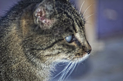
My blind cat.


I have a cat. His name is Salvador. He is twenty-three years old. He has been blind for the last five of those.
It's genetic the vet says- something about an Abyssinian gene.
It doesn't seem (blindness) to bother him that much. He knows my apartment well and the only time he has problems is when something changes, like when I leave the vacuum out or a door that is normally open is closed - then he bonks his head.
Once in awhile, when he can't find me he yowls, kind of like a momma cat for her kittens.
I pick him up and pet him and reassure him I'm here and he's happy.
In the late evenings he likes to go out on the 2nd story deck of my apartment and do (what I call) a "stroll and sniff."
He walks down the deck, sniffing the air and from what I can tell his nose still tells him more about his world then I can ever deduce.
There was a day when he ruled this apartment complex, kept the strays away and lived to torture my neighbors dog.
But Salvador is retired now and is living out his last days, eating, purring, strolling and sniffing.
Some people say I should have him put down, but as long as he isn't in any pain and can still extract some joy out of life (like curling up on my lap, using his paw to scrape the sides of his bowl to get that last bit of tuna) I'll let him be.
I know some day, I'll have to set his kitty-soul free of its' blind and earthly entrapment, but until that day, Salvador will be my cat.
-Steve
Posted by Steve Douglass at 4:33 PM 2 comments
Wednesday, September 9, 2009
The Beatles & my daughter .. an early Photoshop experiment.

I thought this post might be relevant today in light that the release of the remastered Beatles catalog (not to mention Beatles Rock band) and (quite possibly) the expected announcement from Apple that Itunes was going to offer the entire Beatles catalog.
I did this many years ago (too many to count) when I was learning Photoshop and trying out a new scanner. Pretty simple technique, I did a head-replacement and put my daughters (then a teen) head on one of the Beatles.
She liked it so much I made a print of it and it hangs in her home today. He kids all think she really knew the fab four.
So where's Paul?
I think he was dead man.
-Steve Douglass
Posted by Steve Douglass at 7:48 AM 0 comments
Thursday, August 27, 2009
Wednesday, August 26, 2009
Osprey buzz

I shot this MV-22 Osprey (fresh from the factory east of town) out a a test hop today. It circled southwest Amarillo for about ten minutes before disappearing into the gathering cumulus clouds.
-Steve Douglass
Posted by Steve Douglass at 6:43 AM 0 comments
Tuesday, August 25, 2009
How to add depth to a canyon.
A few months ago I took this photo from the rim looking into Palo Duro Canyon. This year the canyon is very lush and green which contrasts well with the red rock. This photo was shot on a day when clouds were gathering making the sky much more interesting than it would be a a sunny day.
PLEASE CLICK ON EACH PHOTO TO SEE THEM FULL FRAME<
Although I liked the shot - I wasn't thrilled with it because the photo couldn't do justice to the amazing depth of the canyon.
To improve (in my mind) the shot I undertook a few processing steps in Photoshop which I feel more expressed this wonderful natural geological beauty-scape we have lying practically at our doorstep.
The first thing I did was to copy the image and paste it into another layer on top of the original.
I then used the brightness and contrast controls to adjust the tonality in the sky (ignoring the landscape) to where the clouds stood out more and weren't so washed out.
Then (on the top layer only ) I (using the adjustment menu) converted the layer to black and white, paying close attention to the gray values in the vegetation and the red canyon walls.
I then used the eraser tool (on the top layer only) to erase the bottom part to reveal the properly exposed canyon on the bottom layer. I then combined both layers by flattening them.
I then copied the image and pasted it into another layer and then (using the image-adjustments-black & white) and removed all the color paying close attention to adjusting the red and green sliders to attenuate the red and green values.
Then (using the layer opacity controls) I slowly took down the opacity until the bottom (colored layered) showed through, but not completely. This technique helps bring out the texture and detail in the rocks and foliage.
I then flattened the image and boosted the saturation levels to where they looked natural, but not overblown like it was in the original photo. I was going for a more muted look.
I then went into my NIk (Colorefex Pro 3.0) filters and used the split-field Graduated Neutral Density filter to darken the top half of the sky which had the effect of making the mesa on the right hand side of the photo, look like it ws in the shadow of a cloud. adding even more depth.
I then used another NIK filter (Tonal Contrast) to bring out even more depth and detail in the canyon, but I then erased the sky (to show the more natural looking cloud-scape underneath) because the filter made them look too contrasty and unreal. 
The finishing touches were to selectively dodge and burn certain sections of the canyon to simulate dappled light coming though the clouds and lighting up parts of the canyon rim and rough terrain.
In closing, I think it gives the scene a sort of hand colored postcard look while also improving the sense of depth to our marvelous Palo Duro Canyon.
-Steve Douglass
Posted by Steve Douglass at 5:54 PM 0 comments
Labels: Palo Duro Canyon
Monday, August 24, 2009
How to make a good candid portrait better.
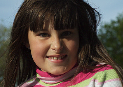
A while back, I took an informal portrait of my grand-daughter. Since I love her so much, I have taken hundreds of photos of her. This one ( taken about six months ago) is one of my favorites. It was one of the first portraits i had taken with a new 70mm to 300mm Nikkor zoom lens.

So I did the following processing steps in Photoshop CS-4.
1. Corrected the overall orange color cast using the saturation controls.
2. Copied the entire image and pasted it into another layer on top of itself.
3. Boosted the reds and greens using the saturation controls. This brought out the color and detail in her top.
4. On the top (now saturated) layer I used my erase tool to let the more natural subdued skin-tones show through by erasing the area around her and hair only.
5. Merged bottom and top layers.
6. added a top layer, and using my brush tool painted bright white (dots) simulated highlights in both eyes giving them a sparkle.
7. Used the blur filter to make the highlights in her eyes look more like reflected sunlight.
9. Merged all layers together again.
10. Used the dodging tool tyo bring out the color of her eyes.
11.. Using "reflector effects" in the NIK Color Effex 3.0 filter pack and used it to fill in the shadows on her face and especially under her left (my right) eye.
12. Used the "Dynamic skin softener" in the NIK Color Effex 3.0 filter pack to add softness and a natural glow to her skin.
13. Copied, cut and pasted the image on top of itself into a new layer.
14. Used "Tonal contrast control"" in the NIK Color Effex 3.0 filter pack to bring out highlights and details in her hair.
15. erased area around her face to let the (softer) facial features show through.
13. Fixed a few (slight) blemishes with the tubber stamp tool and merged all layers and saved the photo as a copy.
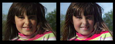
Here's the finished product which (if you hadn't seen the orginal) looks much better and yet still very natural and candid.

Please click on each image to view them full-size.
-Steve Douglass
Side by side comparison:

Please click on each image to view them full-size.
Posted by Steve Douglass at 4:20 PM 0 comments
Thursday, August 20, 2009
4 Ever After
Here's a quick sample of a video I produced for a newly-married, Utah couple's parents as a special gift to be presented at heir reception.
Using photographs provided by the couple, i edited and animated it in IMovie.
It was just a small segment of a much longer and large DVD containing hundreds of photos of the bride and the groom as they were growing up. It took me about four days to produce it.
Everyone at the wedding reception just loved it. maybe you know someone getting married soon who might like a video like this?
If so contact me at the e-mail link above.
PS: The high-definition version looks, sounds and plays much better than this streaming web version.
-Steve Douglass
Posted by Steve Douglass at 3:39 PM 0 comments
Let them eat cake ...

I'm just about to finish up THE CAKE FACTORY site.
It's been an fun (and delicious) project.
I got the gig through my niece, Kristen who is one of the cake decorators there.
Needless to say I've had my pick of delicious cakes, cookies and cupcakes (to photograph for the site) that also somehow ended up in my stomach.
If you are in the Amarillo area and need a custom wedding, birthday or specialty cake, or just have a sweet tooth (like me) and want a delicious cookie, cupcake or brownie, drop in and tell them Steve Douglass sent you.
Also, ask them for a tour while you are there. Watching them create edible works of art is not only fascinating but yummy as well.
HERES THE LINK.
Posted by Steve Douglass at 2:17 PM 0 comments


