Can you imagine what it must look like to a turtle? No wonder he won't come out of his shell.
Thursday, August 27, 2009
Wednesday, August 26, 2009
Osprey buzz

I shot this MV-22 Osprey (fresh from the factory east of town) out a a test hop today. It circled southwest Amarillo for about ten minutes before disappearing into the gathering cumulus clouds.
-Steve Douglass
Posted by Steve Douglass at 6:43 AM 0 comments
Tuesday, August 25, 2009
How to add depth to a canyon.
A few months ago I took this photo from the rim looking into Palo Duro Canyon. This year the canyon is very lush and green which contrasts well with the red rock. This photo was shot on a day when clouds were gathering making the sky much more interesting than it would be a a sunny day.
PLEASE CLICK ON EACH PHOTO TO SEE THEM FULL FRAME<
Although I liked the shot - I wasn't thrilled with it because the photo couldn't do justice to the amazing depth of the canyon.
To improve (in my mind) the shot I undertook a few processing steps in Photoshop which I feel more expressed this wonderful natural geological beauty-scape we have lying practically at our doorstep.
The first thing I did was to copy the image and paste it into another layer on top of the original.
I then used the brightness and contrast controls to adjust the tonality in the sky (ignoring the landscape) to where the clouds stood out more and weren't so washed out.
Then (on the top layer only ) I (using the adjustment menu) converted the layer to black and white, paying close attention to the gray values in the vegetation and the red canyon walls.
I then used the eraser tool (on the top layer only) to erase the bottom part to reveal the properly exposed canyon on the bottom layer. I then combined both layers by flattening them.
I then copied the image and pasted it into another layer and then (using the image-adjustments-black & white) and removed all the color paying close attention to adjusting the red and green sliders to attenuate the red and green values.
Then (using the layer opacity controls) I slowly took down the opacity until the bottom (colored layered) showed through, but not completely. This technique helps bring out the texture and detail in the rocks and foliage.
I then flattened the image and boosted the saturation levels to where they looked natural, but not overblown like it was in the original photo. I was going for a more muted look.
I then went into my NIk (Colorefex Pro 3.0) filters and used the split-field Graduated Neutral Density filter to darken the top half of the sky which had the effect of making the mesa on the right hand side of the photo, look like it ws in the shadow of a cloud. adding even more depth.
I then used another NIK filter (Tonal Contrast) to bring out even more depth and detail in the canyon, but I then erased the sky (to show the more natural looking cloud-scape underneath) because the filter made them look too contrasty and unreal. 
The finishing touches were to selectively dodge and burn certain sections of the canyon to simulate dappled light coming though the clouds and lighting up parts of the canyon rim and rough terrain.
In closing, I think it gives the scene a sort of hand colored postcard look while also improving the sense of depth to our marvelous Palo Duro Canyon.
-Steve Douglass
Posted by Steve Douglass at 5:54 PM 0 comments
Labels: Palo Duro Canyon
Monday, August 24, 2009
How to make a good candid portrait better.
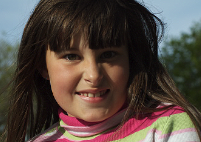
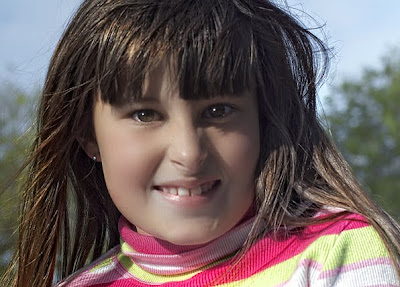
A while back, I took an informal portrait of my grand-daughter. Since I love her so much, I have taken hundreds of photos of her. This one ( taken about six months ago) is one of my favorites. It was one of the first portraits i had taken with a new 70mm to 300mm Nikkor zoom lens.

So I did the following processing steps in Photoshop CS-4.
1. Corrected the overall orange color cast using the saturation controls.
2. Copied the entire image and pasted it into another layer on top of itself.
3. Boosted the reds and greens using the saturation controls. This brought out the color and detail in her top.
4. On the top (now saturated) layer I used my erase tool to let the more natural subdued skin-tones show through by erasing the area around her and hair only.
5. Merged bottom and top layers.
6. added a top layer, and using my brush tool painted bright white (dots) simulated highlights in both eyes giving them a sparkle.
7. Used the blur filter to make the highlights in her eyes look more like reflected sunlight.
9. Merged all layers together again.
10. Used the dodging tool tyo bring out the color of her eyes.
11.. Using "reflector effects" in the NIK Color Effex 3.0 filter pack and used it to fill in the shadows on her face and especially under her left (my right) eye.
12. Used the "Dynamic skin softener" in the NIK Color Effex 3.0 filter pack to add softness and a natural glow to her skin.
13. Copied, cut and pasted the image on top of itself into a new layer.
14. Used "Tonal contrast control"" in the NIK Color Effex 3.0 filter pack to bring out highlights and details in her hair.
15. erased area around her face to let the (softer) facial features show through.
13. Fixed a few (slight) blemishes with the tubber stamp tool and merged all layers and saved the photo as a copy.
Here's the finished product which (if you hadn't seen the orginal) looks much better and yet still very natural and candid.

Please click on each image to view them full-size.
-Steve Douglass
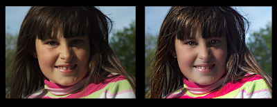
Side by side comparison:

Please click on each image to view them full-size.
Posted by Steve Douglass at 4:20 PM 0 comments


