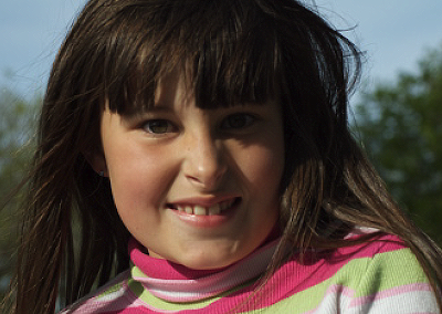
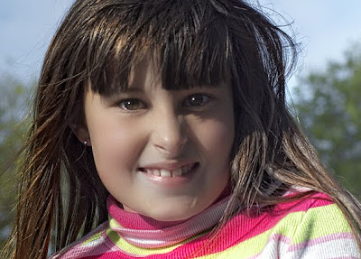
A while back, I took an informal portrait of my grand-daughter. Since I love her so much, I have taken hundreds of photos of her. This one ( taken about six months ago) is one of my favorites. It was one of the first portraits i had taken with a new 70mm to 300mm Nikkor zoom lens.
Telephoto zoom lenses are an excellent choice for portraits for several reasons, chief among them being their long focal length (with used with a large aperture) helps isolate the face from distracting background.
I can't tell you how many times I've seen good portraits ruined by a "merger" where something like a tree (in the background) looks like it is growing out of someone's head.
In any case I took this candid portrait in a park, and although I considered it good (I just loved her smile) it wasn't exactly perfect.

So I did the following processing steps in Photoshop CS-4.
1. Corrected the overall orange color cast using the saturation controls.
2. Copied the entire image and pasted it into another layer on top of itself.
3. Boosted the reds and greens using the saturation controls. This brought out the color and detail in her top.
4. On the top (now saturated) layer I used my erase tool to let the more natural subdued skin-tones show through by erasing the area around her and hair only.
5. Merged bottom and top layers.
6. added a top layer, and using my brush tool painted bright white (dots) simulated highlights in both eyes giving them a sparkle.
7. Used the blur filter to make the highlights in her eyes look more like reflected sunlight.
9. Merged all layers together again.
10. Used the dodging tool tyo bring out the color of her eyes.
11.. Using "reflector effects" in the NIK Color Effex 3.0 filter pack and used it to fill in the shadows on her face and especially under her left (my right) eye.
12. Used the "Dynamic skin softener" in the NIK Color Effex 3.0 filter pack to add softness and a natural glow to her skin.
13. Copied, cut and pasted the image on top of itself into a new layer.
14. Used "Tonal contrast control"" in the NIK Color Effex 3.0 filter pack to bring out highlights and details in her hair.
15. erased area around her face to let the (softer) facial features show through.
13. Fixed a few (slight) blemishes with the tubber stamp tool and merged all layers and saved the photo as a copy.
Here's the finished product which (if you hadn't seen the orginal) looks much better and yet still very natural and candid.

Please click on each image to view them full-size.
-Steve Douglass
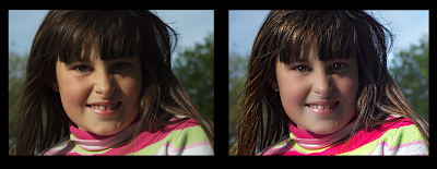
Side by side comparison:

Please click on each image to view them full-size.


0 comments:
Post a Comment